Background
Currently in Tanzania, low-income households can access health information through physical visits to the hospital/clinic, radio and television. However, public hospitals are not easily accessible to every Tanzanian, only 5% of radio broadcasted topics are health-related, and less than 30% of Tanzanians own a TV. The health information gap, therefore, results in unnecessary suffering and death from easily preventable diseases. Furthermore, lack of access to information on family planning continues the cycles of unplanned and teenage pregnancies.
To solve this problem, Moblie Afya was developing the first Swahili USSD application (M-Afya) in Tanzania that uses internet-free mobile technology to provide basic health information, on-demand, as well as personal wellbeing education to young women. However, the health content that is intended for low-income and low literacy users was written by doctors at Muhimbili National Hospital. The M-Afya team needed to test the content on users to see if they would understand it and to test the usability of the entire product system.
Research Goals
- Understand our target user's social and environmental influences on attitudes towards health, especially reproductive health
- Test comprehension of the product’s health content
- Test the product’s usability and information architecture
- Design an intuitive and likeable product for low-literacy users
METHOD
Methods
Step 1 - Secondary Research
I referred to the study: Mobile Interface Design for Low-Literacy Populations (Chaudry et al., 2012) to inform the interview questions.
Step 2 - Rapid Prototyping
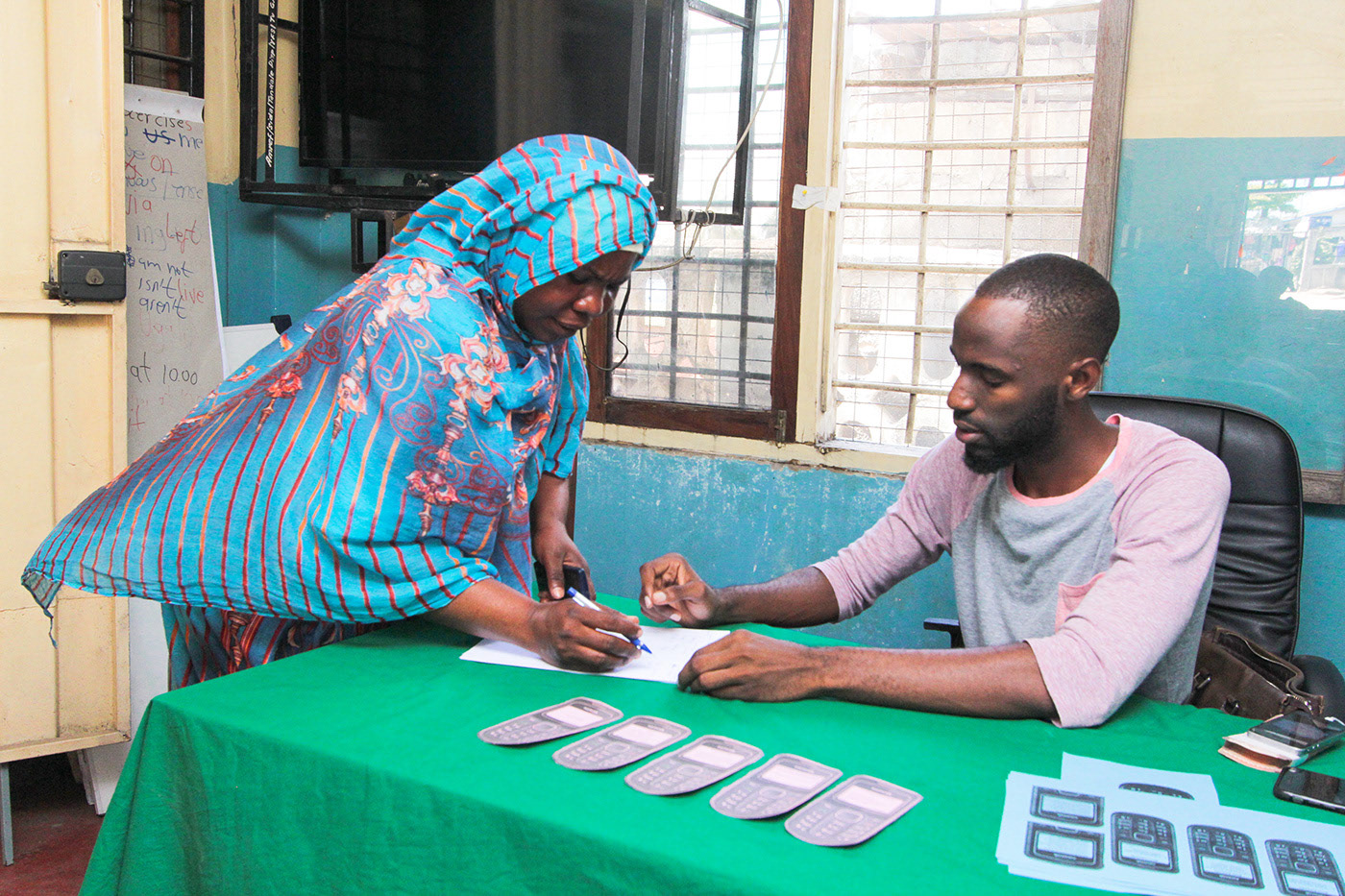
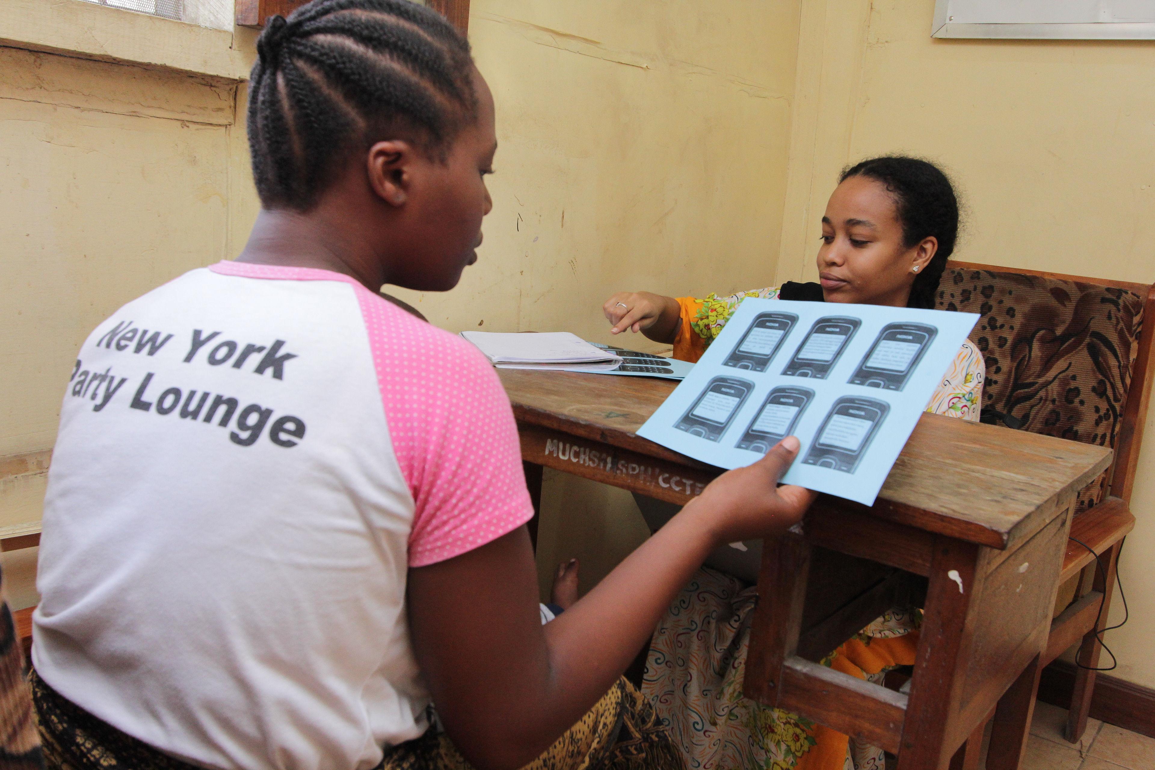
The advantage I had while creating the prototypes is that intended users already have an understanding of the USSD process from using mobile money services. I simply created medium-fidelity prototypes of the user flow for each feature so that users would understand the product's flow. After that, I printed the prototypes with the SMS content to test with the users.
Step 3 - Field Research Design
I designed interview questions in addition to usability testing to better understand the user’s environment, behaviour and attitude towards sexual and reproductive health. I chose Tandale ward in Dar es Salaam as it is the most low-income area in the city. Study details include:
Participants: 150 girls and women aged 12 - 40 years
Location: Tandale Youth Center, Dar es Salaam
Team: 4 field researchers
Step 4 - Conduct Field Research
I translated Nielsen’s 10 Usability Heuristic Questionnaire from English to Swahili to test the content prototypes with 150 users. I then chose 20 users randomly for the interviews to gain insights on the user’s ecosystem and product concept.
Critical Insights
- 55% of users were unable to remember menstruation details
55% of the girls and women in the study could not remember the date when their last period started, which poses a problem for Binti Calendar feature meant to track the menstruation cycle and provide information about fertile days.
- Scientific health terminology was difficult to understand
The majority of participants could not understand terminology and even entire concepts around certain words, for example: “insulin,” “glucose,” “ovulation.”
- Usability scores were lowest for recognizing and recovering from errors
Participants were frustrated about not being able to go back when they had made a mistake. Even though we had the option that said ‘Rudi’ (Back), it wasn’t clear which button to press.
Research Impact
Redesigning the ‘Binti Calendar’ feature
Since most users did not remember the date of their last period, the first screen was changed to prompt users to enter the date when their period starts and added an option in the menu that says, “period hasn’t started yet” which leads them to a page that tells them to come back when their period starts.
Simplifying the health content
The team of doctors at Muhimbili (who wrote the original content) started re-writing the content to simplify health terms by focusing more on explaining the most critical concepts.
Adding widgets to the navigation instructions
The team added a * next to the ‘Rudi’ (Back) option on the screen to make it easier for users to navigate the system
Reflection
Plans need to be adaptable
The original plan was to do the study in 3 different regions in Tanzania but budget constraints limited us to 1 location. I had to adapt by diversifying the participants by age and occupation.
The best designer is the user themselves
This research highlighted the importance of co-creating with the user because it is very easy as a designer to fall into the trap of assumptions and unconscious biases.
